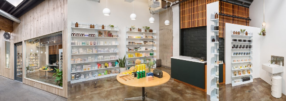
If you live somewhere like me, you’ve seen a pretty basic pharmacy design and layout that extends to pretty much any and every retail pharmacy. Needless to say, the architecture and design can be somewhat lacking in inspiration. Fortunately, there is a new wave in pharmacy architecture that proves to be a bit more enticing.
Traditional pharmacy architectural design generally focuses on:
• Layout – functionality and ease of discovery. They want you to find what you need fast, as I’m sure you do, too.
• Prices – clearly marked and easily distinguishable. Some want to compete in their pricing structure and insurance acceptance.
• Service – friendly, open atmosphere with knowledgeable staff.
• Delivery options – giving you a wide range of ways to get the medicines you need.
Whereas the new pharmacy architecture design focuses on:
• Concepts – taking new ideas and running with them. Perhaps trying a new way to do the same thing. Portland’s Apothecary by Design LLC is doing just that.

A New Apothecary in Portland | Photos from Pinterest
• Graphics – utilizing bolder, more enticing graphics to pull your attention.
• Colors – When you think of most pharmacies, you think white, sterile, with shelves of bottles lined up nice and neat. With the new pharmacy design, gone are the days of white as we welcome in the use of bold new colors.
• Lighting – finding new ways to enhance the visual aspect of their products, lighting is used to accentuate and draw the eye.
• Virtual Assistance – the use of online and virtual assistance is making a huge wave as we enter the future. Not everyone wants to talk directly to a person, so having virtual options can save time and be just the right thing for some people.
• Compound Operation, with other services – getting back to the roots of pharmacy, many are taking the compound operation in-house again, as pharmacists combine, mix, or alter ingredients of a drug to create a medication tailored to the needs of an individual patient.
Around the world, we are seeing new designs pop up and you can check out our Pinterest Board dedicated to the new flavor of Pharmacy Architecture.
What would you like to see in your local pharmacy? Do you like the layout and design they currently use? Or would you like to see a divergence to more design and color? Leave us a comment below and let us know!
###
Carissa Andrews is an passionate author and freelancer from Minnesotan with a focus in creative writing.